


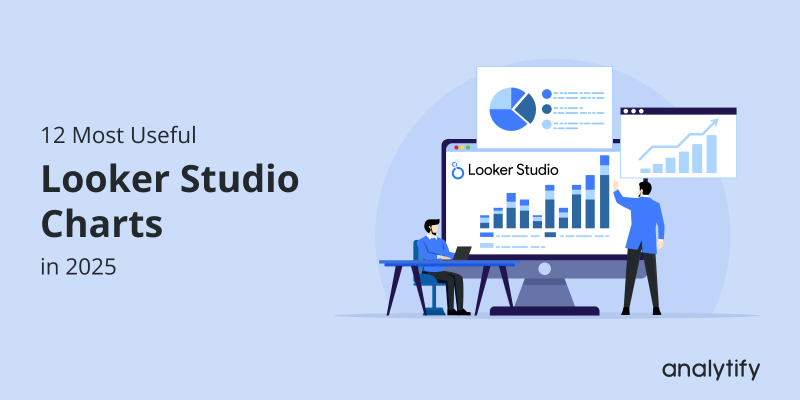
When you open Looker Studio, you’re overwhelmed by a variety of chart options. While this flexibility is essential, it often leaves marketers wondering: Which Looker Studio charts are best suited for my data?
The truth is, the proper data visualization can make or break your report. In this post, I will explain what Looker Studio charts are, how they are created, and why they are valuable in marketing.
By the end, you’ll have a clear roadmap for building Looker Studio reports that actually push more data-driven decisions.
Looker Studio Charts (TOC):
What are Looker Studio Charts?
Looker Studio charts are visual charts you can add to your data analysis reports to make data easier to read, interpret, and act on. Instead of looking at raw numbers, these charts help to reveal patterns and trends at a glance.
Charts In Looker Studio
Looker Studio was initially known as Google Data Studio. Today, it comes with modern styling, advanced customization, and better interactivity. This is what makes Looker Studio Charts one of the most effective free data visualization tools available in the market.
Why Looker Studio Charts are Important
Looker Studio charts are essential for many reasons, the top being a free data visualization tool. Still, here I have highlighted some of the key reasons Looker Studio charts are necessary:
- Transparent reporting: Charts simplify complex data into visuals anyone can understand.
- Better insights: Trends and comparisons are easier to spot when visualized.
- Improved decision-making: Stakeholders can act faster when reports are visual and concise.
12 Most Useful Looker Studio Charts
The most exciting section is here! Let’s explore the top 12 charts every marketer should implement in 2025. Each faction explains what it is, when to use it, and why it’s useful, so you get a broader idea of what charts suit your data the most.
1. Time Series Chart
Time Series Chart in View
What it is: A line graph that plots data points across a time axis (days, weeks, months).
When to use it: Ideal for tracking trends in website traffic, sales, and ad impressions.
Why it’s useful: Helps marketers quickly see long-term patterns and detect abnormalities.
How to Create a Time Series Chart
Step 1: In Looker Studio, register your account first to access the main navigation dashboard.
Learn more about the Complete Looker Studio Setup Guide.
Step 2: Name your report and start creating.
By clicking on Add a Chart, you can add any chart to your canvas.
Click on Add To Chart
Here, I will be adding a Time Series chart.
Time Series Chart Types
You can drag and drop the time series chart on the canvas.
Step 3: Add dimensions on the X-axis and metrics on the Y-axis.
Add date as a Dimension.
I am going to add Date as the dimension. For time charts, date and time are usually the automatic dimensions added.
To add metrics, click the Add metric.
Add Metrics
You will be shown a variety of metrics available for you to add to your time series chart. Select relevant ones.
Choose Metrics for Time Series Chart
After adding suitable metrics, here’s how the time series chart updated on its own.
Time Series Metrics
Step 4: Your time chart is all set.
Click on View
Click on View to interact and view your final time chart.
Time Series Chart
In the same manner, you can create other charts for your GA4 using Looker Studio charts.
2. Scorecard / KPI Card
Sometimes, you need a single number that tells the story. That is where scorecards exist as one of the most used types of Looker Studio charts.
What it is: A simple number visualization (e.g., conversions, revenue, total sessions).
When to use it: Use it when you want to highlight critical metrics at a glance.
Why it’s useful: Keeps dashboards focused on business goals instead of drowning in details.
How to create a Scorecard/KPI card in Looker Studio
Compact Scorecard
Step 1: Click on Add To Chart
Scorecard Charts
Step 2: Choose your Primary Field
Choose Primary Field
You can also keep the date range of the scorecard as fixed or make a custom one.
Change default range
Here I have custom-made the scorecard for Aug 1st – Sep 30th.
Select Time Range
Looker Studio Charts also provide other types of scorecards, such as scorecards with compact numbers.
Choose Any Scorecard
4. Bar Chart
Bar charts are one of the oldest and clearest forms of data visualization. They make comparisons between categories obvious at first glance.
Bar Chart
What it is: Horizontal or vertical bars comparing different categories.
When to use it: Great for comparing channels, regions, or ad groups.
Why it’s useful: Universally understood and simple to present to any audience.
How to make Bar Charts in Looker Studio Charts
Step 1: Click on Add to Charts
Bar Chart Types
Then click on the type of bar chart you need. I have chosen the horizontal bar chart for this guide.
Step 2: Add custom dimensions (x-axis) and segments (y-axis).
Bar Chart dimensions and metrics
The setup of a bar chart allows users to personalize the bar chart according to date ranges and custom metrics/dimensions.
5. Pie and Donut Charts
Pie charts are classic for showing shares, while donut charts give a modern twist with a hollow center for extra labels or metrics.
Pie and Donut Charts
What it is: Circular charts that divide a whole into proportional slices.
When to use it: Best for traffic source breakdowns, device usage, or revenue distribution.
Why it’s useful: Gives a quick sense of percentages and relative importance.
How to create Pie/ Donut Charts
Step 1: Click on Add to Chart
Circular Charts
Step 2: Customize the pie chart by changing the metrics and dimensions to showcase the desired results.
Dimensions and Metrics of Donut and Pie Charts
And here’s how you can create your own pie and donut charts to showcase data more visually than ever.
6. Table with Heatmap
Tables show details, but heatmaps make them visual. By shading cells, you can instantly see highs and lows.
Heatmap and Table Chart
What it is: A table where cells are color-coded based on value intensity.
When to use it: Perfect for campaign performance, keyword rankings, or product sales.
Why it’s useful: Turns rows of numbers into patterns that are easier to interpret.
How to create a Table with a Heatmap
To create a table with a heatmap:
Step 1: Insert a Pivot Table
Choose Pivot Table
Step 2: Add dimensions and metrics
Add custom dimensions and metrics to the Table
Step 3: Navigate to Style >> Metrics
Here you can convert the table into a heatmap.
Select Heatmap
Step 4: The Heatmap table is created.
7. Combo Charts
Sometimes one chart isn’t enough, and that is where combo charts let you compare two related metrics on the same axes.
Combo Charts
What it is: A hybrid chart that mixes bars and a line in one visualization.
When to use it: Ideal for analyzing volume vs efficiency, such as comparing sessions (bars) to conversion rate (line).
Why it’s useful: Reveals relationships that would be missed if metrics were shown separately.
8. Geo Map / Region Map
Maps are powerful when location matters. They let you see where your audience is coming from in a single glance.
Geographic Chart in Looker
What it is: A map colored or marked based on data values by country, state, or city.
When to use it: Ideal for location-based metrics, such as tracking visitors by region.
Why it’s useful: Helps marketers identify geographic strengths and expansion opportunities.
9. Funnel Visualization
Funnels illustrate the step-by-step journey users take, making it obvious where they drop off before converting.
Funnel Chart
What it is: A layered chart illustrating user progress through defined stages.
When to use it: Best for signup flows, checkout processes, or lead funnels.
Why it’s useful: Pinpoints weak spots in your conversion process so you know what to fix.
10. Scatter Plot
Scatter plots are all about relationships. They show how two metrics move together or don’t.
Scatter Plot Chart
What it is: A chart that plots data points on X and Y axes to show correlation.
When to use it: Great for visualizing spend vs return, clicks vs conversions, or engagement vs reach.
Why it’s useful: Makes trends, clusters, and outliers jump out immediately.
11. Treemap
Treemaps pack lots of proportional data into a compact space, making it easy to spot which categories dominate.
Treemap Chart
What it is: A chart that displays categories as rectangles sized by value.
When to use it: Use for revenue by category, traffic by source, or campaign comparisons.
Why it’s useful: Ideal for large datasets where pie charts or bars would become cluttered.
12. Bullet Chart
Bullet charts add context by comparing actual performance against benchmarks or targets.
Bullet Chart
What it is: A bar-style chart with performance ranges and a marker for the target value.
When to use it: Ideal for sales goals, revenue targets, or KPI progress.
Why it’s useful: It not only tells you how much you achieved but also how it stacks up against expectations.
Looker Studio Dashboard Best Practices
Having learned about the most commonly used Looker Studio charts, this section will focus on the best practices in Looker Studio dashboard charts for 2025. These strategies ensure that the charts are effective and clearly represent data.
Looker Studio Charts Dashboard
- Stay consistent: Use uniform colors and fonts.
- Don’t clutter: Less is more. Too many charts can confuse.
- Prioritize KPIs: Keep key metrics at the top.
- Use filters to allow interactivity, enabling users to explore.
- Tell a story: Arrange charts in a logical flow.
Easy Looker Studio Alternative for WordPress Users
Join 50,000+ beginners & professionals who use Analytify to simplify their Google Analytics!
Looker data visualization is a great platform to transform messy metrics into visually appealing charts, but connecting it with GA4 data can be complicated for WordPress users. That’s where Analytify comes in.
Analytify simplifies GA4 reporting by combining directly into your WordPress dashboard. Instead of setting up complex data connectors, you can view GA4 data in a user-friendly interface and then feed it into Looker Studio for advanced visualization.
Analytify Google Analytics Dashboard
This combo lets you:
- Receive scheduled reports about the critical metrics on your own customized period straight into your email. Whether you set up the Email Add-on for weekly or monthly reports, you can stay updated on the most essential statistics of your site regularly.
Customized Introduction Statement in Email Report
- Save time and reduce technical headaches by offering real-time metrics for you to track at any moment.
Analytify Real-time Dashboard
FAQs on Looker Studio Charts
1. What are Looker Studio charts used for?
Looker Studio charts are used to turn raw data into visual stories. Instead of looking at rows of numbers, you can see patterns, trends, and comparisons at a glance. Marketers use them to track campaign performance, businesses use them for sales and revenue analysis, and analysts use them for identifying opportunities or problems. In short, charts make data easier to understand, share, and act on for better decision-making.
2. Which Looker Studio chart is best for tracking trends?
The Time Series chart is the go-to option for tracking trends. It plots data points across a timeline (days, weeks, or months), making it easy to spot whether performance is improving, declining, or staying flat. For example, you can use a Time Series chart to monitor website traffic, conversions, or ad spend over time and quickly identify seasonal patterns, sudden spikes, or drops.
3. Can I combine multiple charts in one dashboard?
Absolutely! In fact, that’s the whole point of Looker Studio. A good dashboard usually combines different chart types to give a complete picture. For example:
Use Scorecards for high-level KPIs (sessions, revenue, leads).
Add a Time Series chart to track performance over time.
Insert Tables or Heatmaps for detailed breakdowns by channel or campaign.
Include Pie or Bar charts to compare segments.
By mixing these charts, you can build dashboards that work for both quick overviews and deeper analysis.
4. What’s the difference between Looker Studio charts and Data Studio charts?
There’s no real difference in how the charts work. Google rebranded Data Studio into Looker Studio in 2022 as part of its broader Looker product family. Since then, Looker Studio has continued to receive updates and integrations that make reporting more powerful, especially with GA4 and BigQuery.
Looker Studio Charts: Final Thoughts
Choosing the right Looker Studio charts is the difference between a confusing report and a dashboard that drives action. From time series charts to funnels and treemaps, each of these Google Looker Studio visualizations has its place.
Begin with the basics, such as time series and KPI cards, and gradually add advanced charts, like funnels, as your reporting evolves, following best practices in Looker Studio charting. That’s all for this post!
For more related posts, check out our:
Now it’s your turn: Which Looker Studio chart do you use most often in your reports? Share your thoughts below!


